|
 |
|
 |
|
| Author |
Message |
BrotherWilliam

Joined: 03 Mar 2018
Posts: 7
Location: Australia
|
 Posted: Mon Mar 12, 2018 6:51 am Post subject: 2019 Newspaper revisited - The Masthead font Posted: Mon Mar 12, 2018 6:51 am Post subject: 2019 Newspaper revisited - The Masthead font |
 |
|
I've been trying to recreate Deckard's newspaper from the original Blade Runner movie. I've scrolled through forums and examined the commendable efforts made by Nyzeki. I've read through Typeset In the Future and got some great information there, but so far I'm not convinced the font for the masthead on Deckard's newspaper has ever been found. Nyzeki used a stylised Old English type font but I don't think it's the right one. Based on other comments from the typeset blog I think it may be one of the Eurostile family font's but with shorter stems.
Font sites haven't been able to scan the image properly or when they do I get very weird results.
Anyone else got some ideas?
 |
|
| Back to top |
|
|
|
|
 |
|
 |
|
|
|
|
| Author |
Message |
rickhoward
Community Guide

Joined: 03 Jul 2016
Posts: 279
Location: Midwestopia, USA
|
| Posted: Mon Mar 12, 2018 11:43 pm Post subject: |
|
|
I think that Nyzeki's banner used American Text, and agree that the prop version was not. I've been looking through old press-on lettering catalogs, but no joy as yet.
Would anyone in the group with the 4k version if the film be willing to pull a few screen caps? Maybe a better view is available... |
|
| Back to top |
|
|
|
|
|
|
|
|
|
|
|
| Author |
Message |
MarsVoyager
Community Member

Joined: 04 Mar 2018
Posts: 18
|
| Posted: Tue Mar 13, 2018 2:11 pm Post subject: Masthead font suggestion |
|
|
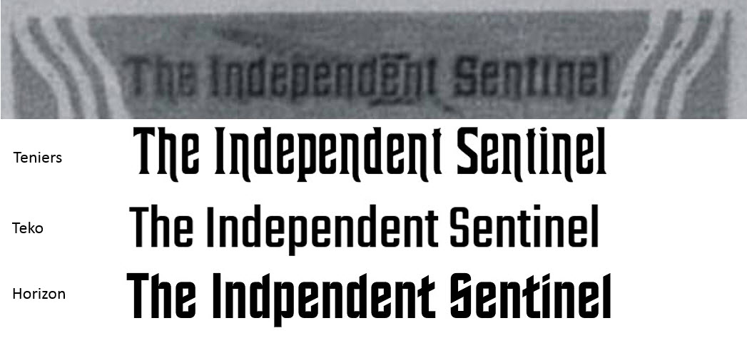
I think the font Teniers is quite close, except the S and perhaps the e which are closer to Eurostile.
_________________
No artificial animals were harmed in the production |
|
| Back to top |
|
|
|
|
|
|
|
|
|
|
|
| Author |
Message |
joberg
Community Member
.jpg)
Joined: 06 Oct 2008
Posts: 9447
|
| Posted: Tue Mar 13, 2018 2:33 pm Post subject: |
|
|
| I should look through my old Letraset stash; I can't, I'm in Brussels right now... |
|
| Back to top |
|
|
|
|
|
|
|
|
|
|
|
| Author |
Message |
eethan
Community Member
Joined: 17 Oct 2017
Posts: 153
Location: France
|
| Posted: Tue Mar 13, 2018 3:18 pm Post subject: |
|
|
Hey! Enjoy Brussels! sorry  |
|
| Back to top |
|
|
|
|
|
|
|
|
|
|
|
| Author |
Message |
MU-TH-UR
Community Member
Joined: 28 Oct 2017
Posts: 16
|
|
| Back to top |
|
|
|
|
|
|
|
|
|
|
|
| Author |
Message |
rickhoward
Community Guide
Joined: 03 Jul 2016
Posts: 279
Location: Midwestopia, USA
|
| Posted: Tue Mar 13, 2018 9:45 pm Post subject: |
|
|
I had come across Teniers today as well. It has been floating around in the back of my mind until I recalled an Art Nouveau poster project I did back in the day...
I also think it is workable, at least largely a match aside from the previously mentioned letter forms. We can't say that there wasn't some artistic mixing and matching of pres-on type, or that the banner wasn't simply hand-drawn. I love, and hate, digging around for fonts from the dawn of digital typsetting.
Ever closer...
  |
|
| Back to top |
|
|
|
|
|
|
|
|
|
|
|
| Author |
Message |
BrotherWilliam
Joined: 03 Mar 2018
Posts: 7
Location: Australia
|
| Posted: Thu Mar 15, 2018 9:54 pm Post subject: |
|
|
| Thanks for identifying the Teniers font. I think it's a pretty close match. I'll see what I can do with an alternate S but it looks good otherwise. |
|
| Back to top |
|
|
|
|
|
|
|
|
|
|
|
| Author |
Message |
joberg
Community Member
Joined: 06 Oct 2008
Posts: 9447
|
| Posted: Sun Mar 18, 2018 4:16 pm Post subject: |
|
|
TFS the Teniers font (even if the S doesn't quite match)  |
|
| Back to top |
|
|
|
|
|
|
|
|
|
|
|
| Author |
Message |
BrotherWilliam
Joined: 03 Mar 2018
Posts: 7
Location: Australia
|
| Posted: Fri Mar 23, 2018 7:58 am Post subject: |
|
|
So, I've done some digging on Prop Summit and a few other places and I think I've managed a reasonable version of the English side of The Independent Sentinel. I got Teniers and I've substituted a Eurostyle S for the masthead. Still needs some tweeking though.

I've had a look through NYzeki's old Japanese site and run that through google translate but I speak zero Japanese beyond what I remember from the old John Rhys Davies Shogun series
Anyone here speak (or at least read) passable Japanese to work out lettering basics? |
|
| Back to top |
|
|
|
|
|
|
|
|
|
|
|
| Author |
Message |
Futurepig
Community Member

Joined: 28 Jun 2011
Posts: 54
|
| Posted: Wed Jun 27, 2018 11:23 pm Post subject: |
|
|
If anyone needs a custom font, let me know.
_________________
 |
|
| Back to top |
|
|
|
|
|
|
|
|
|
|
|
| Author |
Message |
joberg
Community Member
Joined: 06 Oct 2008
Posts: 9447
|
| Posted: Thu Jun 28, 2018 6:27 pm Post subject: |
|
|
| Looking good! |
|
| Back to top |
|
|
|
|
|
|
|
|
|
|
|
| Author |
Message |
Replicant 13
Community Member

Joined: 18 Jul 2011
Posts: 912
Location: OffWorld Park, USNA
|
| Posted: Mon Sep 23, 2019 11:09 pm Post subject: THE PERFECT MATCH |
|
|
Thought I'd chime in here, having considered attempting this one myself one day -
If you happen to peruse the earlier parts of my thread on the making of the Blade Runner magazine covers (PAPER PROPS - The Magazines Reimagined), I too struggled with matching fonts, just knowing that somewhere there HAD to be that perfect match which - for whatever reason - seemed to elude me.
This was way back in the 2010's and upon reading various blogs and such, and just doing a bit of rather time-consuming sleuthing, I discovered one important fact - that some of the fonts used back in the '80s before the Mac and such were core versions of fonts that didn't quite make the leap to digital. Some variants of certain characters were dropped in the transition, leading me to think I was off-track, but this was not the case.
This may (or may not) be of help here, but to your point, the old Chartpack and Formatt transfer types were sometimes more complete collections, in this respect.
But otherwise, I was able to match fonts exactly - with very few exceptions - but it took time and patience.
A good place to start any search is 1001fonts.com. It's free, but you'll have to do some digging. The only cost there is your time.
Of course, there ARE other font sites and you won't find everything on 1001 (many are disguised by other names to avoid licensing issues), but my advice - if you are really ernest in your quest is - Keep looking!
I can only think of one instance where I found it necessary to manually trace a letter or two in Illustrator, for a more accurate match.
Good luck if you decide to venture further. As I said, I may tackle this one myself. So much to do, so little time.
• BTW After buying a couple of cheap reference books at a Half-Price bookstore, I finally gained some help here from Temponaut - translating the Japanese on Tom Southwell's FASH cover (pg. 8 of my thread). But he can be a bit hard to reach . . .
Have a Better One! - R13
_________________
.png) Gosh, you've really got some nice toys here . . . Gosh, you've really got some nice toys here . . . |
|
| Back to top |
|
|
|
|
|
|
|
|
|
|
|
|
You cannot post new topics in this forum
You cannot reply to topics in this forum
You cannot edit your posts in this forum
You cannot delete your posts in this forum
You cannot vote in polls in this forum
|
|
|
|
|
|
|
|