|
 |
|
 |
|
| Author |
Message |
Mr Webber
Community Member

Joined: 13 Apr 2008
Posts: 1824
Location: Terra Australis
|
 Posted: Fri Mar 18, 2011 5:39 am Post subject: Building the Nostromo Emergency Destruction System.Possible? Posted: Fri Mar 18, 2011 5:39 am Post subject: Building the Nostromo Emergency Destruction System.Possible? |
 |
|
This is one of my all time favaorite prop design and creations.
Walking through my local hardware superstore yesterday i spotted the hose used and obviously it is a common hose but it just made me think of the self destruct unit straight away and what would be involved in putting a replica together. Im just thinking of the floor unit with the massive lid but you could also consider the other mechinisms used on the wall.
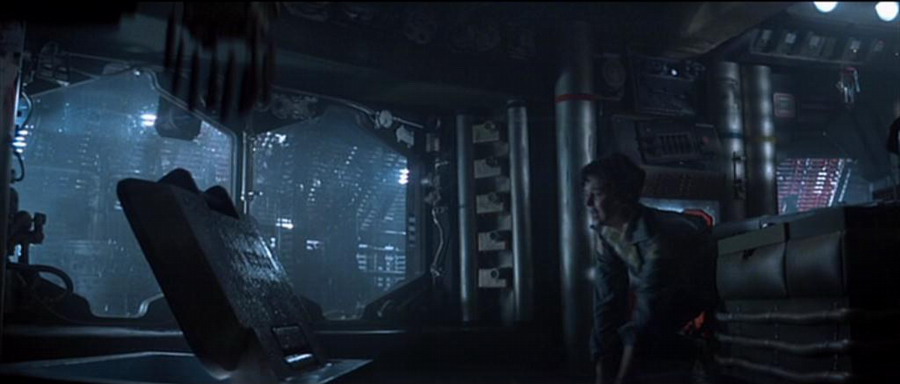 
The lid and base are a challenge but ive put things together i wouldnt have dreamed of a few years ago so i`ll try to throw together some wood framing and ply cladding on that one. Also thinking of carving something appropriate out of a large block of styrene foam, have never done that before but have seen it done several times.
The text and graphics on the inside of the lid will either come from someone generous and talented here or i will have to pay for someone to design them. It would be simple to fit sidelights to the inside of the lid, more difficult but still possible even if lid is foam.
Now it starts to get real tricky. To me, the four plate bases of the telescopic tubes are either directly found items or modified found items. What those possible items are i have no idea and would appreciate any input on that. Possibly part of some clutch plate assembly.
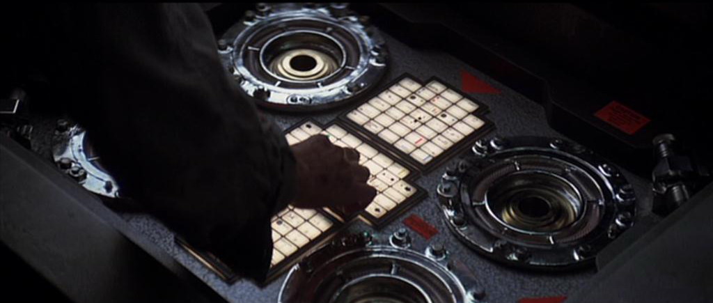 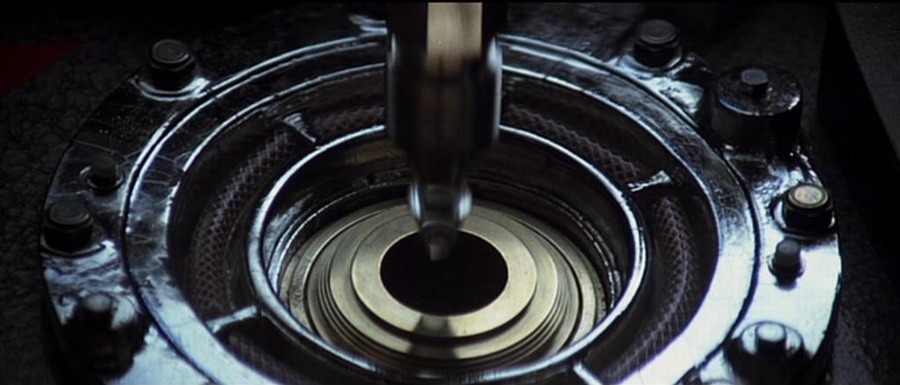
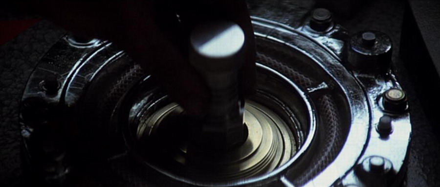 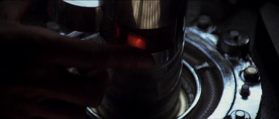
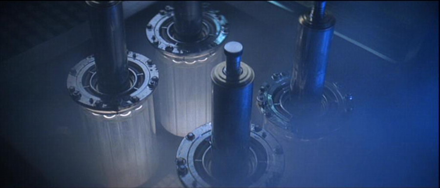 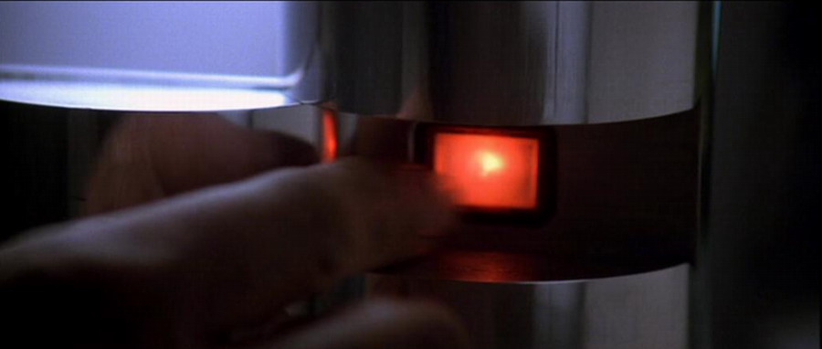
The telescopic tubes also have the feel of something found, possibly even a telescope itself.
If not it would require the skills of a metalsmith. I would want the same functioning style of the originals with inbuilt practicle switches. This same metalsmith would also be able to produce the four special keys required to activate the tubes, unless someone here wants to produce them, possibly in resin? The three sets of white buttons only need to be three sheets of white acrylic with seperation and detail added with decals etc and lit from underneath. The whole thing is covered with a hammer finish paint job and ive used a local product from a spray can that does a great job.
I dont plan to make the glass/clear acrylic base`s that extend from the bottom of the telescopic tubes but never say never i guess but havent given them much thought at this piont. Just an idea at this stage but it shows that inspiration comes from anywhere, even an old bit of hose. At the very least, i want to make a 1:1scale, wall mountable, side lite replica of the inner lid text and graphics. If this or the whole thing has been tackled elsewhere please post about it and as always, any contributions of anything are always welcome.
Posted this on therpf yesterday and have already got some great and generous feedback and made a little progress.
_________________
Formerly offworld66 |
|
| Back to top |
|
|
|
|
 |
|
 |
|
|
|
|
| Author |
Message |
andy
Community Guide

Joined: 01 Nov 2006
Posts: 6237
Location: Rochester, NY
|
| Posted: Fri Mar 18, 2011 1:40 pm Post subject: |
|
|
saw this over at the RPF. Great project. The case, or case lid is something I have seen in other movies, so it has to be something found. I have no idea what it is though.
Andy |
|
| Back to top |
|
|
|
|
|
|
|
|
|
|
|
| Author |
Message |
Vader
Community Member

Joined: 19 Feb 2011
Posts: 267
Location: Sweden
|
| Posted: Fri Mar 18, 2011 2:46 pm Post subject: |
|
|
It is so very, very familiar ... it feels like I could almost bet something substantial that I've handled it IRL.
It's like some sort of an armoured hatch ... probably vintage; WW II, most likely. From a vehicle...? Or from a ship?
A most annoying feeling. Like the answer is hiding at the back of my mind.
_________________
26354 |
|
| Back to top |
|
|
|
|
|
|
|
|
|
|
|
| Author |
Message |
Mr Webber
Community Member
Joined: 13 Apr 2008
Posts: 1824
Location: Terra Australis
|
| Posted: Sun Mar 20, 2011 5:30 am Post subject: |
|
|
It will probably come to you where you least expect it Vader.
_________________
Formerly offworld66 |
|
| Back to top |
|
|
|
|
|
|
|
|
|
|
|
| Author |
Message |
Mike Rush
Community Member

Joined: 30 Jul 2009
Posts: 184
Location: Hertfordshire, England
|
| Posted: Mon Mar 21, 2011 7:36 am Post subject: |
|
|
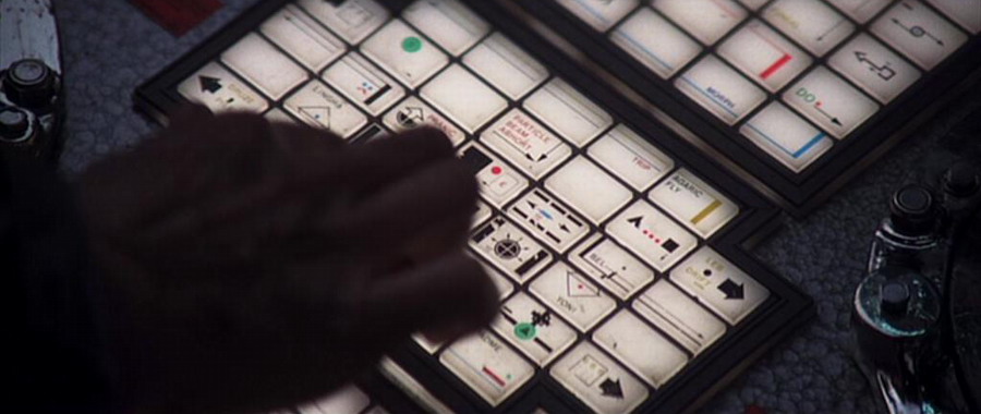
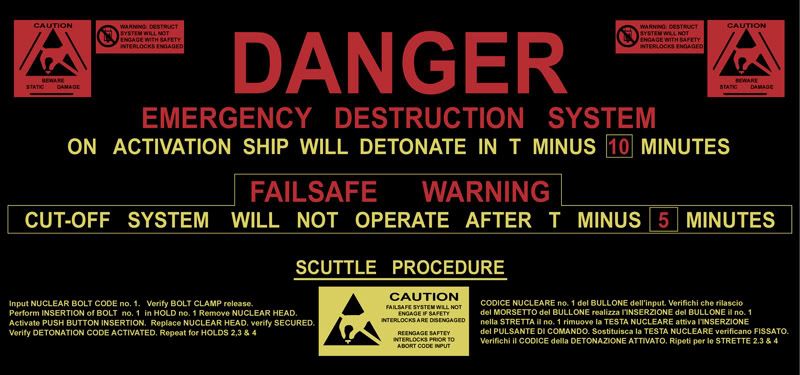
Have you managed to take the perspective out of the sign? I had a quick go:

Ended up with a ratio of about 20:9. This is based on an assumption that the red caution signs are roughly square, plus overlaying some text afterwards to check (shown white). I don't have all the right typefaces yet though. 
_________________
Mike
"We're not heroes - we're from Finchley" |
|
| Back to top |
|
|
|
|
|
|
|
|
|
|
|
| Author |
Message |
joberg
Community Member
.jpg)
Joined: 06 Oct 2008
Posts: 9472
|
| Posted: Mon Mar 21, 2011 7:44 am Post subject: |
|
|
Good stuff Mike; I sent Tim the Letraset used in the movie (for the illuminated pads)...some are from 1972 believe it or not, but most of them are from 1981  . I'll check again my stach to determine the fonts on the lid. Exciting project! . I'll check again my stach to determine the fonts on the lid. Exciting project! |
|
| Back to top |
|
|
|
|
|
|
|
|
|
|
|
| Author |
Message |
Mr Webber
Community Member
Joined: 13 Apr 2008
Posts: 1824
Location: Terra Australis
|
| Posted: Mon Mar 21, 2011 9:34 am Post subject: |
|
|
Thats incredible Mike.
Theres also someone on the rpf who is also kindly tackling this so at the end there should be a fairly awesome version or versions available for peeps to play with.
_________________
Formerly offworld66 |
|
| Back to top |
|
|
|
|
|
|
|
|
|
|
|
| Author |
Message |
The Loyalizer
Community Member
Joined: 08 Oct 2007
Posts: 742
Location: Down in 4th Sector, Chinatown
|
| Posted: Mon Mar 21, 2011 7:42 pm Post subject: |
|
|
| Mike Rush wrote: | Have you managed to take the perspective out of the sign? I had a quick go:
Ended up with a ratio of about 20:9. This is based on an assumption that the red caution signs are roughly square, plus overlaying some text afterwards to check (shown white). I don't have all the right typefaces yet though. |
I think most of the typeface was standard Arial Black/Bold. Here's the one I did a while back, not sure if I still have the photoshop file for it though. I do recall I couldn't find the actual graphic for the caution signs and had to do them by hand. Also the right side instructions for the scuttle procedure I couldn't make out from the old screen cap I was using, so they're not accurate.
Would be kind of cool to do this as a backlit wall display maybe with some buttons under it and such.
_________________

"We began to recognize in them a strange obsession..."
http://fcomin.cgsociety.org/gallery/ |
|
| Back to top |
|
|
|
|
|
|
|
|
|
|
|
| Author |
Message |
Mike Rush
Community Member
Joined: 30 Jul 2009
Posts: 184
Location: Hertfordshire, England
|
| Posted: Tue Mar 22, 2011 3:53 am Post subject: |
|
|
Sorry to disagree  but there are at least three different typefaces in there and none of them is Arial. (In my opinion.) but there are at least three different typefaces in there and none of them is Arial. (In my opinion.)
In those days it was usually Helvetica. Most people think Arial and Helvetica are the same thing, but they're not. They are very similar, but if it's accuracy you're after then look at the capital R.
(Plus: Arial wasn't even designed until 1982, never mind in in the public domain!)
Chances are this was mostly done with Letraset which explains why the letter-spacing is all over the place. (Compare 'emergency' with 'system'. Someone was scrambling to fill up the space!)
The 'DANGER' appears to be bold Gill Sans, but the 'R' doesn't quite conform. As the letters are so large, it might even have been hand-drawn.
Sorry to be a bore, but I work with fonts so I can't help noticing these things. 
_________________
Mike
"We're not heroes - we're from Finchley" |
|
| Back to top |
|
|
|
|
|
|
|
|
|
|
|
| Author |
Message |
joberg
Community Member
Joined: 06 Oct 2008
Posts: 9472
|
| Posted: Tue Mar 22, 2011 7:06 am Post subject: |
|
|
Mike is right: R is different on that lid. That's the main prob with Letraset: you have to have a steady hand and not be rushed to apply them in a straight line (the S font is a bitch and can be misplaced easely)  |
|
| Back to top |
|
|
|
|
|
|
|
|
|
|
|
| Author |
Message |
Mike Rush
Community Member
Joined: 30 Jul 2009
Posts: 184
Location: Hertfordshire, England
|
| Posted: Tue Mar 22, 2011 7:33 am Post subject: |
|
|
That's true; in fact all the curved letters (C,G,S etc) are designed to extend above the cap line and below the baseline. They're actually taller than the M, E etc.
So if you set the bottom of your Letraset S on the baseline, the top will be way above where it should be.
Not that any of this matters now that we have DTP, but it's interesting trivia to know.
_________________
Mike
"We're not heroes - we're from Finchley" |
|
| Back to top |
|
|
|
|
|
|
|
|
|
|
|
| Author |
Message |
joberg
Community Member
Joined: 06 Oct 2008
Posts: 9472
|
| Posted: Tue Mar 22, 2011 11:16 am Post subject: |
|
|
Yep, the days of doing everything by hand is probably gone, technology has given us the time to do things really fast (and easy to a certain level).
I remember my Father doing entire adds with Letraset  talk about patience (and that was also before the photocopier were sophisticated enough to permit good cut and paste jobs). talk about patience (and that was also before the photocopier were sophisticated enough to permit good cut and paste jobs). |
|
| Back to top |
|
|
|
|
|
|
|
|
|
|
|
| Author |
Message |
SKIN JOB 66
Community Member

Joined: 16 Jan 2008
Posts: 2724
Location: FRANCE
|
| Posted: Tue Mar 22, 2011 4:49 pm Post subject: |
|
|
| Mike Rush wrote: | That's true; in fact all the curved letters (C,G,S etc) are designed to extend above the cap line and below the baseline. They're actually taller than the M, E etc.
So if you set the bottom of your Letraset S on the baseline, the top will be way above where it should be.
Not that any of this matters now that we have DTP, but it's interesting trivia to know. |
Reminds me of Art school, LOL ! (but, Tim, what Mike is telling you here is very important, basic typographical rules you must know before handling Lettraset sheets !)
BTW, is it just me or the "C" from "CUT-OFF SYSTEM WILL..." line looks handwritten ? (bolder than the rest of the letters, with a strange curve...)
Fred
_________________
THE FUTURE IS A THING OF THE PAST |
|
| Back to top |
|
|
|
|
|
|
|
|
|
|
|
| Author |
Message |
andy
Community Guide
Joined: 01 Nov 2006
Posts: 6237
Location: Rochester, NY
|
| Posted: Tue Mar 22, 2011 8:16 pm Post subject: |
|
|
I bet I still have letraset sheets somewhere. I also still have the hot wax roller for making paste ups.
The "C" I think looks different because it has some glare from the side lamps accross it. I could have also been made from another character and cut to be mad a "C". It looks natural on the un-adjusted picture of the lid.
Andy |
|
| Back to top |
|
|
|
|
|
|
|
|
|
|
|
| Author |
Message |
The Loyalizer
Community Member
Joined: 08 Oct 2007
Posts: 742
Location: Down in 4th Sector, Chinatown
|
| Posted: Wed Mar 23, 2011 1:13 am Post subject: |
|
|
I stand corrected. I do recall having to tweak the scaling on that font more than once when I was working on it.
_________________
"We began to recognize in them a strange obsession..."
http://fcomin.cgsociety.org/gallery/ |
|
| Back to top |
|
|
|
|
|
|
|
|
|
|
|
| Author |
Message |
joberg
Community Member
Joined: 06 Oct 2008
Posts: 9472
|
| Posted: Wed Mar 23, 2011 6:52 am Post subject: |
|
|
What I sent Tim are a kind of greeblies/wiggets placed on the illuminated pads found at the bottom of the prop. These guys basically used the margins of Letraset sheets to do a lot of the designs found on those pads.
I supplied those margins + other signs and logos that Tim will have to simply transfer or cut and paste onto the keys (less work ).
Of course, as people here who have used Letraset in the past, you can do all kind of designs using fonts, arrows, combining lines to do other interesting stuff (as we can see on the pads).
It becomes a Lego game with almost endless possibilities! |
|
| Back to top |
|
|
|
|
|
|
|
|
|
|
|
| Author |
Message |
Pro Mod
Community Member
Joined: 13 Aug 2010
Posts: 109
Location: Manchester, England
|
| Posted: Wed Mar 23, 2011 5:03 pm Post subject: |
|
|
Great project and something I've always wanted to do myself.
To help with scaling the panel, the square antistatic sign is 57mm wide x 56.5mm high and the rectangular one is 84mm wide x 37.5mm high.
I know this because I own three sheets of the original stickers.
Could I make a suggestion that rather than carving the lid out of a block of foam, why not cut out the lid profiles from plastic sheet or mdf, space them apart and then skin the edges with styrene or similar.
This way is a lot less messy and the finishing is much easier to achieve.
- I'm in the model making industry and that's the way we'd do it.
I 'm looking forward to seeing this progress.
*For your information at the end of the production this and the wall panel were burnt along with the majority of the sets and props. |
|
| Back to top |
|
|
|
|
|
|
|
|
|
|
|
| Author |
Message |
Mr Webber
Community Member
Joined: 13 Apr 2008
Posts: 1824
Location: Terra Australis
|
| Posted: Wed Mar 23, 2011 9:17 pm Post subject: |
|
|
Thanks very much for all your input guys, i really think this can be pulled off now, its such an iconic prop for me, not just as a prop itself but where it came in the movie, a great sequence.
Your definately right Pro Mod, thats the way to go for sure, bit of a stretch for my range though.
I think the best way to go for me to start off is to concentrate on the lid.
To replicate it as true as possible would be the goal with the side lighting practicle but the sign will be backlit to give maximum effect. Even if only the lid was ever completed, it would be tremendous as a display on the wall, very unique.
Only one of the keys needs to be made from metal as im sure we can get the rest done in resin, ive searched too much for clutch plate assemblys that look like what was used in the original, cant tell the differences now and the tubes, well they can wait.
_________________
Formerly offworld66 |
|
| Back to top |
|
|
|
|
|
|
|
|
|
|
|
| Author |
Message |
joberg
Community Member
Joined: 06 Oct 2008
Posts: 9472
|
| Posted: Thu Mar 24, 2011 6:50 am Post subject: |
|
|
Thanks Pro Mod for the pro imput, it's always very much appreciated
As for the project, to rush it could be, IMO, detrimental. I think that the scale and the details needed to have a close or very close repro will take time (as we have seen so far with the research, the lettering, even with the people on the RPF and their valuable imput).
Take you time Tim, I know that, at the end, it'll be great to see everything come together |
|
| Back to top |
|
|
|
|
|
|
|
|
|
|
|
| Author |
Message |
SKIN JOB 66
Community Member
Joined: 16 Jan 2008
Posts: 2724
Location: FRANCE
|
| Posted: Fri Apr 01, 2011 8:20 am Post subject: |
|
|
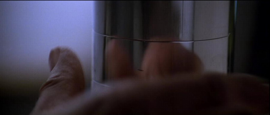
I don't know what this key is doing exactly, but I guess it's something rather nasty...
Fred

_________________
THE FUTURE IS A THING OF THE PAST |
|
| Back to top |
|
|
|
|
|
|
|
|
|
|
|
|
You cannot post new topics in this forum
You cannot reply to topics in this forum
You cannot edit your posts in this forum
You cannot delete your posts in this forum
You cannot vote in polls in this forum
|
|
|
|
|
|
|
|