|
 |
|
 |
|
| Author |
Message |
Replicant 13
Community Member

Joined: 18 Jul 2011
Posts: 912
Location: OffWorld Park, USNA
|
 Posted: Tue Oct 11, 2011 7:31 pm Post subject: GAFF 'S STAFF Posted: Tue Oct 11, 2011 7:31 pm Post subject: GAFF 'S STAFF |
 |
|
Gaff has issues . . .
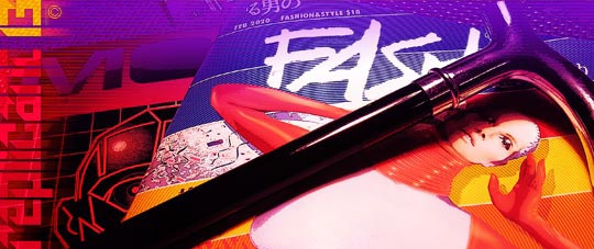
Perhaps it is appropriate. Nine magazines, nine pages in this post.
HAB1 - R13
_________________
.png) Gosh, you've really got some nice toys here . . . Gosh, you've really got some nice toys here . . .
Last edited by Replicant 13 on Tue Oct 25, 2011 2:10 am; edited 1 time in total |
|
| Back to top |
|
|
|
|
 |
|
 |
|
|
|
|
| Author |
Message |
joberg
Community Member
.jpg)
Joined: 06 Oct 2008
Posts: 9471
|
| Posted: Tue Oct 11, 2011 8:54 pm Post subject: |
|
|
I think it's an omen...9 magz, 9 pages as you said; eager to see what will come up after all this wonderful work and research  |
|
| Back to top |
|
|
|
|
|
|
|
|
|
|
|
| Author |
Message |
Replicant 13
Community Member
Joined: 18 Jul 2011
Posts: 912
Location: OffWorld Park, USNA
|
| Posted: Tue Oct 11, 2011 10:17 pm Post subject: Right/Wrong/Southwell |
|
|
To be clear, I do not mean to criticize Southwell and crew. As I have said before, no doubt they were limited by resources and by time.
That said, based on the information from Temponaut, the use of Japanese atop the FASH cover is incorrect, both in content and application, but for the sake of accuracy, here is the "corrected" characters as applied on the original cover.
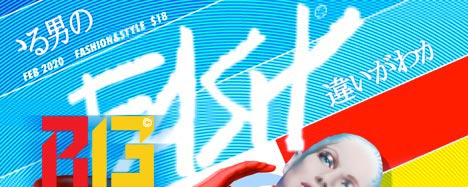
In short, right but wrong. I hope to adjust this inaccuracy on my final version, incorporating a more logical statement, but for now this solves the riddle . . .
I want to thank all who contributed to its eventual solution.
HAB1 - R13
. . . now, about that fat kid on the DORGON cover . . . . 
_________________
Gosh, you've really got some nice toys here . . .
Last edited by Replicant 13 on Tue Oct 25, 2011 2:11 am; edited 1 time in total |
|
| Back to top |
|
|
|
|
|
|
|
|
|
|
|
| Author |
Message |
joberg
Community Member
Joined: 06 Oct 2008
Posts: 9471
|
| Posted: Wed Oct 12, 2011 7:10 am Post subject: |
|
|
As you said they didn't have the time to do things the way they wanted...would it be different now? I hope for the sake of people watching the movie and can read Japanese (or any language for that matter). I think S. Mead mentioned that the Chinese/Japanese lettering on his drawings were accurate...can somebody confirm?
As an artist myself and a French teacher also, I always make sure that the text used to make signs or any other visual design is accurate.
It's to simply respect the other's language(s)... |
|
| Back to top |
|
|
|
|
|
|
|
|
|
|
|
| Author |
Message |
Replicant 13
Community Member
Joined: 18 Jul 2011
Posts: 912
Location: OffWorld Park, USNA
|
| Posted: Sun Dec 11, 2011 1:06 am Post subject: Larger Prints? |
|
|
Work has interfered - end of year demands and deadlines, but in the past couple of months I have contiinued to refine the covers, in an effort to move forward with the work featured here. I have yet to determine a final direction to take with the last cover (FASH), hoping to translate the article titles, as well as correct the errors we were made aware of by Temponaut's generous response to my inquiries.
In addition, I have continued to investigate printing options for the covers, with some interesting (and perhaps predictable) conflicts with content.
AN INQUIRY
In the meantime I have moved forward with another more-involved project, as well as giving thought to offering larger prints of a couple of the ads I created (initially as magazine backs). These would be limited runs, not laser prints, but digitally printed on a nice grade, bright white stock (11"w x 17") and offered for a limited time as a framable print. I am curious if that offer appeals to anyone here. Of course the cost and timing are yet to be determined. I would probably go the PayPal route.
Have A Better One in 2012 - R13
_________________
Gosh, you've really got some nice toys here . . .
Last edited by Replicant 13 on Sat Mar 24, 2012 4:17 am; edited 1 time in total |
|
| Back to top |
|
|
|
|
|
|
|
|
|
|
|
| Author |
Message |
Replicant 13
Community Member
Joined: 18 Jul 2011
Posts: 912
Location: OffWorld Park, USNA
|
| Posted: Sun Dec 11, 2011 1:50 am Post subject: More Human Than Human |
|
|
Sora. Another 'Basic Pleasure Model'. Brought to you by Dr. T.
.jpg)
HAB1 - R13
_________________
Gosh, you've really got some nice toys here . . . |
|
| Back to top |
|
|
|
|
|
|
|
|
|
|
|
| Author |
Message |
joberg
Community Member
Joined: 06 Oct 2008
Posts: 9471
|
| Posted: Sun Dec 11, 2011 11:21 am Post subject: |
|
|
Glad you're back Rep13...I'm sure people will be interested; too bad I'm broke right now (that's why I haven't built or contributed much lately  ). Keep up the good work ). Keep up the good work |
|
| Back to top |
|
|
|
|
|
|
|
|
|
|
|
| Author |
Message |
Replicant 13
Community Member
Joined: 18 Jul 2011
Posts: 912
Location: OffWorld Park, USNA
|
| Posted: Thu Apr 05, 2012 6:46 am Post subject: FONT DISCUSSION |
|
|
To continue a discussion triggered by the work of SynaMax, I felt it best to move my font-related comments here, rather than clutter his posting even further . . .
To continue -
Yes Feuyaer, in my earlier searches I did check out the sites you mention.
Actually ITC Serif Gothic was used for the subheads on the MONI cover. As you can see below, the digital form lacks the slanted "e" and rotating this version doesn't quite match. To replace the "e" Coquette is close, but lacks the subtle serif and Mink is also too "soft" or rounded, and its cap "M" too wide to match ITC Ronda used on the DROID cover. Pacific again lacks the serif on the tail of the "e". ITC Kabel might be a better match, but also lacks a serif, and Blippo's "M" is closer, but much too bold.
.jpg)
The challenge with fonts is that there are SO many similar families, with new ones continually added to the mix. And over the decades, with alterations to existing families and name changes due to the legalities of marketing, it makes for a difficult hunt.
Looking at a few fonts used on the various paper props, you will notice the similarities of those Southwell chose to create his covers. As mentioned earlier, aside from weight, Blippo looks like Bauhaus, which looks like Kabel and is close to Serif Gothic, and so on.
It seems there is always some detail (a serif or a descender or some other subtle characteristic) that keeps them from matching up exactly.
As SynaMax has done for his police ID - http://www.propsummit.com/viewtopic.php?t=3576 - after discovering my findings it was just more efficient to trace existing digital characters as a guide and make the necessary adjustments to create the absent slanted "e" or the missing "M".
I've seen past efforts that just missed the mark, when an incorrect font was used, or a single character was substituted but the weight was noticeably wrong.
Picky? Perhaps. As they say, "The devil's in the details."
HAB1 - R13
_________________
Gosh, you've really got some nice toys here . . . |
|
| Back to top |
|
|
|
|
|
|
|
|
|
|
|
| Author |
Message |
joberg
Community Member
Joined: 06 Oct 2008
Posts: 9471
|
| Posted: Thu Apr 05, 2012 7:16 am Post subject: |
|
|
I'll have to do some research and look at the 500+ sheets of vintage Letraset I have and try to find an exact match...I'll do that as soon as tomorrow  |
|
| Back to top |
|
|
|
|
|
|
|
|
|
|
|
| Author |
Message |
Replicant 13
Community Member
Joined: 18 Jul 2011
Posts: 912
Location: OffWorld Park, USNA
|
| Posted: Thu Apr 05, 2012 7:17 am Post subject: AN UPDATE |
|
|
In regard to my cover designs, I have submitted some possible subheads to Temponaut to replace the non-sensical one on the FASH cover. He has generously offered to translate these into the appropriate Japanese characters, as time permits . . .
Much appreciated.
- R13
_________________
Gosh, you've really got some nice toys here . . . |
|
| Back to top |
|
|
|
|
|
|
|
|
|
|
|
| Author |
Message |
Replicant 13
Community Member
Joined: 18 Jul 2011
Posts: 912
Location: OffWorld Park, USNA
|
| Posted: Thu Apr 05, 2012 7:22 am Post subject: Letraset and Formatt |
|
|
I too have a box of dry-transfer type I've (foolishly) saved from the 80's. . . . somewhere. No doubt useless at this point in time, but I may have to check it out as well. I seriously doubt I have any of the fonts discussed here . . .
I was told (years ago) that you could possibly resurrect it with a light dusting of spray adhesive. Never tried it, but . . .
Keep me posted, Joberg. Thanks.
HAB1 - R13
_________________
Gosh, you've really got some nice toys here . . . |
|
| Back to top |
|
|
|
|
|
|
|
|
|
|
|
| Author |
Message |
joberg
Community Member
Joined: 06 Oct 2008
Posts: 9471
|
| Posted: Thu Apr 05, 2012 9:29 am Post subject: |
|
|
For difficult transfer my Father (who worked for 35 years as a graphic designer with Letraset) gave me 2 tricks for old sheets.
1: Transfer the letter on clear tape, pick-up the tape and the now transfered text and apply (instant decals )
2: Brittle fonts? Tape the back of the transfer sheet, or letter you want to transfer, then with a tongue depressor rubb as you would normally and the letter will stick to the tape and stay whole.
The only prob with this trick is that the tape/letter part is thicker than the normal Letraset transfer. |
|
| Back to top |
|
|
|
|
|
|
|
|
|
|
|
| Author |
Message |
Feuyaer
Community Member

Joined: 10 Oct 2007
Posts: 125
Location: Canada
|
| Posted: Thu Apr 05, 2012 10:20 am Post subject: |
|
|
You're right....at this point, it's probably just easier to work around those characters then to try find a perfectly matching font that probably doesn't exist
_________________
 |
|
| Back to top |
|
|
|
|
|
|
|
|
|
|
|
| Author |
Message |
Replicant 13
Community Member
Joined: 18 Jul 2011
Posts: 912
Location: OffWorld Park, USNA
|
| Posted: Thu Apr 05, 2012 7:08 pm Post subject: MYSTERIES |
|
|
All -
I didn't quite follow the procedure Joberg(?) Are you suggesting transferring the type to the "sticky" side of the tape? How does THAT work? Am I just missing something?
- - - - -
Feuyaer - I did spend (it could said 'wasted') quite a bit of time researching this before I stumbled across the link I mentioned earlier, but I learned something I didn't know, so it was worth the effort. And I've applied that knowledge elsewhere, but speaking of . . .
There is ONE curious font that I've yet to identify - going back to that pesky DORGON cover that started my first thread on PS. It could be that the low resolution of the sample image is the culprit here, but (again) due to one or two characters, I've hit a dead end. If you look at the subhead directly under "DORGON", it appears to be Futura Black (or Extra Bold) - that is until you reach the "R" and particularly the "S".
As you can see below, the angled "S" as it appears on the cover is NOT a cap Futuru - Bold or otherwise. I quickly created how it appears to me, and it also seems similar to the "S" in Lithos Bold, but both look out of place. Additionally, the car "R" appears to be rounded at the upper left corner (circled). Again inconsistent with Futura.
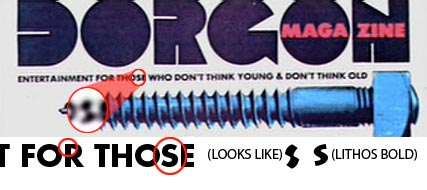
I seem to recall seeing a font that IS similar in these details, but as yet I haven't found it . . .
HAB1- R13
_________________
Gosh, you've really got some nice toys here . . . |
|
| Back to top |
|
|
|
|
|
|
|
|
|
|
|
| Author |
Message |
joberg
Community Member
Joined: 06 Oct 2008
Posts: 9471
|
| Posted: Thu Apr 05, 2012 7:43 pm Post subject: |
|
|
Yep, you'll apply the sticky side of the clear tape behind the font you wanna use...to be precise and that explanation is for people who never used/saw a Letraset sheet, the sheet has 2 different sides: a shiny side (letters are in the normal position) and the mat side (letters are now reversed)...the tape is apply to the mat side.
The tape keeps the letter from cracking or splitting while you transfer it.
As I said before, the down-side to that trick is that you'll have to cut around the letter, not only to remove it from the sheet but also to get rid of the sticky clear part of the tape  and you'll have now a "raised" font since the thickness of the tape is more than that of the original Letraset transfer. and you'll have now a "raised" font since the thickness of the tape is more than that of the original Letraset transfer. |
|
| Back to top |
|
|
|
|
|
|
|
|
|
|
|
| Author |
Message |
joberg
Community Member
Joined: 06 Oct 2008
Posts: 9471
|
| Posted: Fri Apr 06, 2012 8:54 pm Post subject: |
|
|
So at least my search for that elusive e has, I think, been successful.
It seems that you can find it in: Avant-Garde Gothic X-Light.
I had seen it in: Avant-Garde Gothic Medium(was not bad but too thick),but as soon as I saw that sheet of X-Light I knew I had hit the jackpot. Another possibility was: Lubalin Graph Bold, but again not as close as X-Light
I don't think that the upper corner of the R is rounded (seems to me like Futura Demi-Bold)...then again with Letraset, Tom could've messed-up on the transfer 
The funky S is still a mystery...one of my thought was that he maybe used a Medium Outlined font and darkened it to do the letter.
Possible if you have to do a few of them (not an long text: too much work)
There! I hope it'll help you? |
|
| Back to top |
|
|
|
|
|
|
|
|
|
|
|
| Author |
Message |
Replicant 13
Community Member
Joined: 18 Jul 2011
Posts: 912
Location: OffWorld Park, USNA
|
| Posted: Sat Apr 07, 2012 12:43 am Post subject: Raiders of the Lost Fonts |
|
|
Joberg -
I appreciate all your efforts.
A Brittle Subject
Thanks for the explanation of the dry-transfer trick, Joberg. I guess I DID understand, after all. It was the last part that was a bit confusing, as I was expecting the result to result in some transfer ability. While it removes the type from the sheet, the required trimming seems more hassle than benefit. In the age of the Mac, it's just easier to create it digitally.
The Mystery of DROID
While you HAVE found a good solution to the mystery slanted "e", sadly, other characters are of. Once again, there are so often fonts that ALMOST match, but not quite. In checking the individual glyphs (characters) online at MyFonts.com, there are several weights of Avant Garde - and so, a good match in that respect, but other characters don't match, like the cap "M". The same factor applies to Lubalin Graph, plus it suffers from being a square serif. So in both cases, we are still playing mix and match.
Meanwhile, SynaMax, with his discovery of "Pump", had revealed another apparent perfect match to the font used for the DROID subhead. As he pointed out, a slightly heavier weight was also used for the name "NOSTROMO" featured on the back of the jackets used in Scott's previous film, "ALIEN". HOWEVER, I must retract my earlier comment as the PUMP font is still not a perfect match. It solves the problems with the slated "e" and the alternate cap "M", but other characters still match better using the ITC Ronda font. With the exception of the cap "M" I feel that Ronda remains the best choice . . .
The MONI Question
As far as I can tell Serif Gothic IS the font used for the subheads on the MONI cover, but its similar slanted "e" must be a casualty of the digital translation.
That DORGON Problem
Returning to the DORGON cover, that mystery subhead remains in question. I agree that a version of Futura Bold seems the best fit, but with time that may be proven wrong as well, with its obvious character anomolies.
And so, the quest continues . . .
HAB1 - R13
_________________
Gosh, you've really got some nice toys here . . . |
|
| Back to top |
|
|
|
|
|
|
|
|
|
|
|
| Author |
Message |
joberg
Community Member
Joined: 06 Oct 2008
Posts: 9471
|
| Posted: Sat Apr 07, 2012 8:30 am Post subject: |
|
|
You're welcome Rep13...oh well, as you said the quest continues.
I talked to my Father lately and he promised me to send his collection of old Letraset sheets...to be continued. |
|
| Back to top |
|
|
|
|
|
|
|
|
|
|
|
| Author |
Message |
Replicant 13
Community Member
Joined: 18 Jul 2011
Posts: 912
Location: OffWorld Park, USNA
|
| Posted: Sat Apr 07, 2012 9:17 am Post subject: The Quest |
|
|
Thanks Joberg.
Sorry to "rain" on the parade of informative contributions, but THE ANSWER is what we seek, and to borrow a popular phrase "The Truth Is Out There".
I will look forward to your future "finds".
HAB1 - R13
_________________
Gosh, you've really got some nice toys here . . . |
|
| Back to top |
|
|
|
|
|
|
|
|
|
|
|
| Author |
Message |
joberg
Community Member
Joined: 06 Oct 2008
Posts: 9471
|
| Posted: Sat Apr 07, 2012 3:54 pm Post subject: |
|
|
| No rain on my parade Rep13, I agree 100% with you. If you want accurate, then the effort is worth while |
|
| Back to top |
|
|
|
|
|
|
|
|
|
|
|
|
You cannot post new topics in this forum
You cannot reply to topics in this forum
You cannot edit your posts in this forum
You cannot delete your posts in this forum
You cannot vote in polls in this forum
|
|
|
|
|
|
|
|